It is no secret that I adore creative table settings. Spring brings a bevy of charitable events where creative table designs are at their peak. One such event is the national charity event by DIFFA Design Industries Foundation Fighting Aids Dining by Design at Pier 94 on the West Side Highway. This year, it's 16th, designers and industry heavyweights put forward their big production best, building out environments that just had to be seen to be believed. This event, sponsored by the New York Design Center, Architectural Digest (the AD Home Show is on at the Pier as well), The New York Times, Interior Design Magazine and Manhattan Magazine, really sets the tone for table setting feats, with major theatrical installation pieces created by the best minds in the business. I have been attending this event for ages, and the fun part is that it draws an artsy cool and creative crowd mixing modern, traditional and artistic visual masterminds.
Here are some of the many tables that grabbed my attention:
I was completely enamored with the Benjamin Moore table, with a riot of colors used to paint every surface area. The pop art fantasy their creative team came up with was fantastic, a bit Keith Haring, an bit Warhol.
Alternating chairs were painted in an array of bright hues and everything on the table was touched by color.
Even the floor was transformed by bold swaths of color
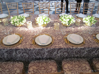
Providing the first look at her Aerin for Lee Jofa fabric collection, Aerin Lauder designed a beautiful table with Montrose, a lavender on natural linen print. Both feminine and strong, the graphic fabric was used en masse, covering the walls, long table and chair cushions. I can't wait to see what the rest of the fabric collection looks like. Hanging overhead is another sneak preview of her glamorous pendant lights with Visual Comfort.
A row of white parrot tulips arranged in her crystal and gold bowls graced the center or the table, interspersed with rustic woven wicker votives, and place settings were composed of crisp white and gold china with woven raffia chargers and bamboo handled flatware. The overall effect was understated chic with pretty touches. It was such a pleasure to join the Kravet's and their guests for the evening, dining with such a fun group. I was seated next to the delightful Jon Call and great color aficionado Lindsey Coral Harper, and Newell Turner of Hearst Design Group was sitting across the table.
Thom Filicia created a lounge atmosphere with living room setting and buffet service for the NYDC area. It was move-in ready.
He mixed his Vanguard designs with other great pieces, layering textural natural materials and burnished metal and luxe finishes.
A branch-inspired metal candelabra sits on a bar in front of a bright, multicolored modern abstract painting.
Pairing striking black and white columns and a giant single lantern, the Architectural Digest table was set with a tangle multicolored Ranunculus and Anemone arrangements, chunks of rock crystal, and black and white porcelain china.
Ah, sweet fleurs
Ah, sweet fleurs
Shiny and matte mixed metal textured surfaces with exotic, animal and floral motifs at Michael Aram's table. So transporting.
A black and white cabana and a bike added a casual vacation feel to Frette's Italian countryside theme.
A black and white cabana and a bike added a casual vacation feel to Frette's Italian countryside theme.
Ralph Lauren Home created a serene desert vibe with glowing lanterns overhead, a modern wooden table with benches and a stunning waterfall backdrop. Big bunches of monochromatic white Ranunculus (my favorite) were placed down the table in a row of vases.
What a statement a single type of flower makes.
What a statement a single type of flower makes.
Echo celebrated their iconic printed scarf, capturing butterflies in flight, snakes, and bold blooms. The back-lit scarves of various sizes was very creative.
Modern design lovers sat surrounded by iconic modern designs old and new at Design Within Reach with orb chandeliers from Roll and Jill lighting the long table.
Mark Blackwell created a pattern on an orange wall out of his china patterns, and set the tree stump table with tulips.
I never tire of plates on walls, as long at it is done with dramatic flair as it is here.
I never tire of plates on walls, as long at it is done with dramatic flair as it is here.
I guess spring has become synonymous with butterflies, since it is also a prominent motif at Eric Warner by Aesthete, Ltd. for Tracy Reese . An intaglio made entirely out of moss was a creative way to hang artwork from the wall.
Arteriors showcased their Barry Dixon collection, encasing their booth with his exotic cut-out white wooden screens. A grisaille painting adds an old-world feel to a modern setting.
Rachel Laxer Interiors and Robert Kuo created an ode to Fragonard with a mural of a girl falling from a swing, and lush centerpiece filled with fresh fruits and flowers.
Croscill had a zillion tiny flowers in bud vases around the centerpiece that sat on quilted fuchsia fabric.
A moody Midnight Garden showcased grey blue hues of Beacon Hill fabrics with a high arrangement of twinkling lights and mossy Orchid-covered tree.
Interior Design Magazine's MC Escher meets De Chirico table designed by Ali Taylor, with red and black squares accented with red.


No comments:
Post a Comment