Mixing warm modern and antique pieces in his work, southern interior designer Robert Brown is known for his mastery of simplicity, clean lines and elegant neutral - with - a - pop - of - color palettes. His interiors make your shoulders drop and relax, and want to have a cocktail. As a designer that understands classic scale and proportion so well, it made sense that he channel this talent into furniture design. A partnership with Macrae allowed him to use his fashion and textile background for inspiration, and the result is southern sophisticated. In New York for Blogfest to launch the furniture collection at the Lee Jofa showroom, you can see the hallmarks of his clean design with masculine yet modern lines.
Whenever designers create rooms in the front area at Lee Jofa, I pay attention. They are a nice way to show a designers sensibility and showcase their new designs. Using a wonderful grey paint, the walls envelop, resulting in a sophisticated modern-inflected study. Clean lines and a lack of cluttered surfaces allow the furniture pieces to enhance the architectural aspects of the room.
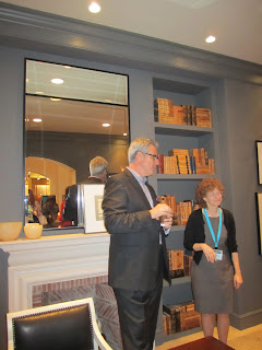
Bob chatting with Lisa Kravet at the launch.
A beautiful Parsons-style desk, The Griffin Writing Table, in a rich, dark wood with pared down objects on it is a perfectly refined place to work. That Maple tree creates a serene feeling by bringing a bit of the natural world in.
Using a clear glass box to neatly display desk items keeps things tailored and orderly.
Another angle of the desk.
The handsome Barkley Bar with deco and mid century lines hides contents but adds stature.
Southerners know the art of hospitality, so of course, a pull - out shelf for a drink has been included in the McDaniel Lounge Chair.
The low-profile sleek and modern Kathryn Slipper Chair has a wooden frame painted in a chalk white finish. A great lounger.
A classic wooden chest of drawers with linear brass pulls re-invents a classic antique form by taking the best attributes from it. A modern color field painting in rosy pink hues adds just the right amount of color to the grey walls.
The detailed interlocking demilune pattern on the back of The Chandler Chair really stand out in the white finish. I would say this is an instant favorite.
A classic column is always a wonderful spatial device that can enhance an entry flanking a doorway. The Chambers Column is a clean lined version of a classic style that has endless functions.
Idea alert! The lucite antlers bring your eye up the wall, and a corner screen below it is an interesting surface to hang artwork on.


No comments:
Post a Comment