Monday, January 31, 2011

MERGERS AND AQUISITIONS: HEARST DEAL TO BUY ELLE DECOR GOES THROUGH


Photo courtesy of Elle Decor
The newest issue of Elle Decor

Hearst has just acquired Elle and Elle Decor from French publishing company Lagardère, a statement has just confirmed. The transaction includes publishing rights to fashionable Elle (except for the French edition), with 102 titles in 15 countries-- the U.S., Russia & Ukraine, Italy, Spain, U.K., China, Japan, Netherlands, Czech Republic, Hong Kong, Mexico, Taiwan, Canada and Germany and extensive digital operations, with 50 websites and numerous mobile and tablet applications. Included in the whopper deal are 10 global editions of Elle Decor,Woman’s Day, Car and Driver, Road & Track and Cycle World in the U.S.; Red in the U.K. and Holland.

The $887M deal puts Hearst at the forefront of the shelter magazine category, adding Elle Decor to their stable that includes House Beautiful, Veranda, Country Living.

LAMSHOP HITS NYC FOR THE GIFT SHOW

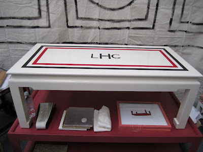
Interior designer Lindsey Harper and great friend Maggie Currey are showing their painted furniture and accessories line Lamshop at The New York Gift Show for the first time. I met the two Southern gals Lindsey, Maggie and their decorative painter friend Jay Lohmann when they launched at High Point a few years ago. Their collection has grown to include fabulous hand-painted malachite, tortoise and racing stripe finishes.
Check them out at Booth 48086!

The girls got creative with their booth, using painted canvas walls with decorative details.

I wonder if I can buy the M monogram tray after the show?

Vroom- racing stripes and monogram make for a snappy combination.

A faux malachite painted table and tray are tres chic.

Ming tables are dressed up in fancy finishes.

Sunday, January 30, 2011

New Concept House Plans Unveiled!

Simply Elegant Home Designs has added a new Concept Plans gallery page at Concept Plans and Custom Home Design.  The page has a flash gallery of home designs that we have started, but are just waiting for the right client to fully develop.  These concept plans basically represent a starting point towards the design of a new custom home.

A shingled cottage home design that could serve as a great mountain cabin plan or beach house.  

A modern cottage with an open floor plan and a beautiful front porch.  The roof lines are simple, yet dramatic.

A mountain lodge with wrap around porch!

Simple yet unique farmhouse plan with a wrap around porch and a main floor master bedroom.  Classic Midwest Living

An elegant cottage home design with a welcoming front porch.
You can check out more of the gallery at  Concept Plans and Custom Home Design

Saturday, January 29, 2011

Modern Cottage House Plan Update - The Afton

Simply Elegant Home Designs has updated the design of our Modern Cottage House Plan - The Afton.  We liked the old design for it's modern simplicity, but wanted to provide a fresh version for those with a bit more traditional sensibilities.  I've highlighted some of the changes below.

BEFORE
Here is our previous design.  Nice - so we just wanted to add a few touches to make it a bit more traditional.

AFTER
The new front elevation.  We added a an "eyebrow roof" above the wrap around porch, added muntins to the windows and changed the color tones of the exterior.  These changes give the home design a more soothing feeling and give it more of a beach cottage aesthetic.  By the way you can check out an exterior animation at Modern Cottage Exterior Video
View from rear yard.  We added a wrap around porch that connects to the screen porch.  This is a great home plan for outdoor living


Interior image from dining area through kitchen to living room.  We updated materials and color tones.   And we have added a great video that walks you through the main floor spaces.  You can check that out at Modern Cottage Interior Video
 All in all I think you can see that a few subtle changes can make a significant difference in a home design.  So let us know if you think.  Do you like the "before" or the "after"?

By the way - you can see more information on this plan at Modern Cottage House Plan! 

Friday, January 28, 2011

GIFT SHOW PREVIEW: OOMPH'S FURNITURE IS MADE FOR FUN

Naming their latest collection after their favorite resort and exotic location, Harbour Island, Oomph wows once again. Their new pieces have easy to use silhouttes, and are made well. Crisp and tailored, they work anywhere and add some jazz to an all white or color filled interiors. They will be at Pier 94,Booth 41005 at this year's NY Gift Show. Stop by and buy!

Fancy a game? Their new Backgammon table is divine design for the competitive set. I am thrilled to finally see someone making a killer game table, what took so long?
Their Fenwick Chart Coffee Table has an inlaid nautical chart, perfect for planning the next Vineyard sailing race route.

The Harbour Island Coffee Table is chic and simple with a contrast top.

I love anything hot pink. The Harbour Island Side Table has a nice large drawer and contrasting colored top that makes it really pop. It matches their Orange and Pink Ikat Pillow.

As crisp as a tailored white shirt, their new Slipper Chair with navy trim is ship shape.

Look, the now classic Tini Tables now have new tops! Choose from a variety of moorish inspired patterns to add jeuje to your Oomph.

The Tini with new tops

Photos courtesy of Oomph
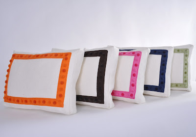
Snazzy new Racetrack pillows come with a bright ribbon dot border for a jolt of color.


Thursday, January 27, 2011

Home Design Ideas - Crazy with Tile!

I recently ran into a photo of a simple bathroom design that I wanted to share with you.  It's a really skinny, small, simple, unique and fantastic powder room within a 1910 Georgian Mansion in San Francisco.  Check it out below.
This powder room is a contrast of the very modern and the very ornate.  It starts off as a very spare space with almost awkward proportions.  Add to that the modern wood vanity, vessel sink and faucet.  This is contrasted by the "crazy" - but well designed tile pattern, reinforced by the stained glass window and the ornate mirror. 
Detail view of the tile pattern.  I cannot imagine the man-hours that went into this.   But you have to admit it's very cool.
All in all a very quirky but beautiful powder room.  So todays lesson is this:
  1. Keep it simple but pay attention to the details.
  2. A contrast of styles can be very dramatic.


If you want to learn more about this bathroom you can check out the link where I found it:
http://arizonafoothillsmagazine.com/in-house/design-and-architecture/san-francicso-decorator-showcase-features-marsh-clark-powder-room

NY GIFT SHOW PREVIEW: SISTER PARISH'S PRINTS CHARMING ACCESSORIES DEBUT

I cannot contain how excited I am for these new Sister Parish Design fabric covered accessories and pillows. Accordion files, desk blotters, picture frames, note pads, pencil cups, photo albums, pillows, tissue box covers, wastebaskets, ice buckets, trays, napkins and tablecloths await you. I want one of each to have great gifts on hand at all times! This is why I am convinced I need a gift wrapping closet and a shelf in it for future gift giving.

Sister Parish's granddaughter Susan Bartlett Crater and Libby Cameron, Sister Parish's protégé and colleague founded Sister Parish Design, and launched their fantastic collection of fabrics and papers several years ago. Their accessory line will debut at the NY Gift show this weekend, say hi to Libby and Susan at Pier 94 Booth 44047!

All your favorite Sister Parish prints make for lively accessories. Dress up your office desk at work with a blotter and pencil cup to bring a bit of style to your space.

Photos Courtesy of Sister Parish Design
Pattern love!

Napkins and cloths make entertaining with style a snap

They make it so easy, these pillows are ready to go

Wednesday, January 26, 2011

GIFT SHOW PREVIEW: AUDREY STERK DESIGNS

Audrey Sterk, a decorative painter, has a charming logo for her brand. It speaks to her creative spirit and innovative ideas

Her original mural represents a panoramic view of the Nantucket landscape. The pivoting position of the viewer is from Altar Rock and begins with a view of the creeks spanning around Monomoy beach with Brant Point lighthouse and Coatue in the distance. Continuing past Polpis Harbor, Great Point lighthouse, and into Sconset town including Sankaty lighthouse and the once used Nantucket Railroad.

For the last decade, Nantucketer Audrey Sterk has created wall murals and custom decorative painted finishes for homes on the island and in New York. Based on her love of nature and the beauty that inspires her, she uses the Nantucket landscape as well as graphic elements as a springboard in her work. From Americana to early scenics, Audrey livens up her interpretations for the way we live today. She makes her NY Gift Show debut with a line of coffee and end tables covered in canvas and hand-painted decorative finishes. In addition, she will also be showing her customizable wallpapers and screens. Stop by Pier 94 At Home Booth 41049 and tell her Stylebeat sent you!

Audrey's High Point booth

A winner- the Circle & Stars Charcoal/Cream Coffee Table, will be in her NY booth. Her tables are coated with a durable water based acrylic finish to maintain their looks.

Photos courtesy of Audrey Sterk
The table in a living room adds a punchy decorative flair

Monday, January 24, 2011

GIVE THE SWIRL A WHIRL

Il Papiro helped make Florentine handmade papers popular stateside when they opened a New York store twenty five years ago. Before that, those that traveled to Firenze would visit their Via Cavore store and stock up, bringing back picture frames, desk accessories and journals. They helped create the craze for all things marble, and no desk was complete without a matching desk set. The marbleized pattern has made a comeback and now graces more than just paper.

Photo courtesy of Shandells
Dress up your sconces or chandelier with these handmade marbleized paper covered shades from Shandells.

Photo courtesy of Highland Court
A new fabric Blush in Plum from Highland Court's Phillip Gorrivan II Collection.

Photo courtesy of Ruzzetti and Gow
This dramatic French glazed pottery Terre Vernisee ceramic platter from Ruzzetti and Gow has just the right amount of splatter to make an impact.

Photo courtesy of Cavallini
Cavallini Italian hand crafted Ceramic Marbles are beautiful -- each one is a different, crazy mix of colors, available from Paper Luxuries.

Photo courtesy of Touch of Europe
I feel like I am back in Florence where I bought every swirled bit of paper I saw. Punch Studio's Mini Notebooks with a Monogram from Touch of Europe are so chic and just the thing to pull out of your tote to jot a note.

Photo courtesy of Kate's Paperie
Wrap that special gift in gorgeous hand made Thai Marble paper with gold ink from Kate's Paperie.
I have long coveted these dragged and speckled Marbleized Paper Mats from Dransfield and Ross.

Photo courtesy of Bell'Invito
Cirque-Frame hand engraved stationery and blue flecked liner from Bell'Invito.

Photo courtesy of Ruzzetti and Gow
Ruzzetti and Gow's unusual Unikite Stone Box has a peach and green palette I love.

Photo courtesy of D and R
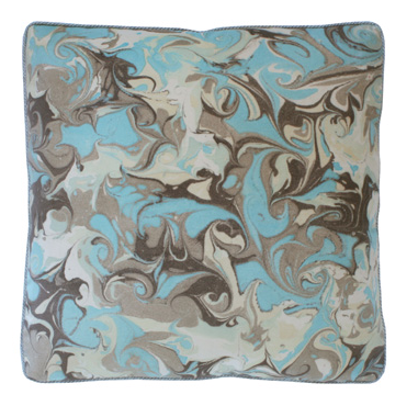
Add a bit of swirl to your sofa with the Florentine Marble Pillow from Dransfield and Ross.

Sunday, January 23, 2011

BRING IT TO THE TABLE: WOMEN OF INTERIOR DESIGN NETWORK

When designing women get together to strategize and collaborate, anything can happen! Do you need a design resource or have a resource to share? Perhaps you are looking for a job in design or just be a voice for others to learn from. Share your experiences and wisdom with the group. We as Women In Design need to stick together and work together.
What can you bring to the table?

Find out at their next event:

When: Tuesday January 25th from 6:30 - 9:30 PM

Who: Guest Speaker Lena West

What: Networking Event With Appetizers and Drinks $15

Where: NY Stone Manhattan Showroom at 30 West 21st Street

What To Expect: Learning what social media strategy is right for you

Rsvp to Lana lana@anthonylawrence.com or
Sherrislskov@clsterling.com

A bit about BITT:
Started by Vice President of one of the best upholstery and drapery workrooms, Anthony Lawrence-Belfair, Lana Lawrence wanted to create a community for women in design. BITT means Bring it To The Table, and is a round table of voices from all areas of interiors. It is a networking group for women in the interior design industry -- a community of professional women working in the interior design field. Meetings are held the last Tuesday of the month with goal of networking, sharing ideas, collaborating, and having your voice heard.

Saturday, January 22, 2011

Home Design Ideas - Drop the Ceiling!

My design philosophy is all about getting big design impact from simple ideas.  After all good design ought not to be expensive.  So here is a simple trick that I have been using for years - "Drop the Ceiling".  Take a look at the examples below and I think you will agree.  Simple Idea - Big Impact!

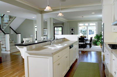
Here I added a gypsum board "bulkhead" to help define the spaces on either side of the kitchen.  Making the walls extra thick allowed space for ductwork in this otherwise wide open floor plan.
This home design offered for sale at Deephaven Modern Cottage
Here is the same bulkhead idea as seen from the dining area.
This home design offered for sale at Deephaven Modern Cottage

In this home I again utilized the dropped ceiling theme to define the space between kitchen and dining.  Here the client wanted a little more segregation of the spaces, so we crafted a beautiful buffet cabinet and anchored it at the bulkhead.

Here you can see a subtle drop in ceiling above the foyer.  The crown molding and color tone differences help to emphasize the edges of the space.
This home design offered for sale at Lakeland Cape Cod

Similar to above we positioned dropped "soffits"along the circulation lines between rooms.  Simple gypsum board "columns" marked the corners of the spaces.  We took advantage of the soffits by placing the main ductwork runs within.
This home design offered for sale at Apple Valley Foursquare
Powered by Blogger.
Text Backlink Exchanges

Labels

Blog Archive